Tuesday, November 12, 2024
Button with a Scaling Animation in SwiftUI
Read time: 8 min
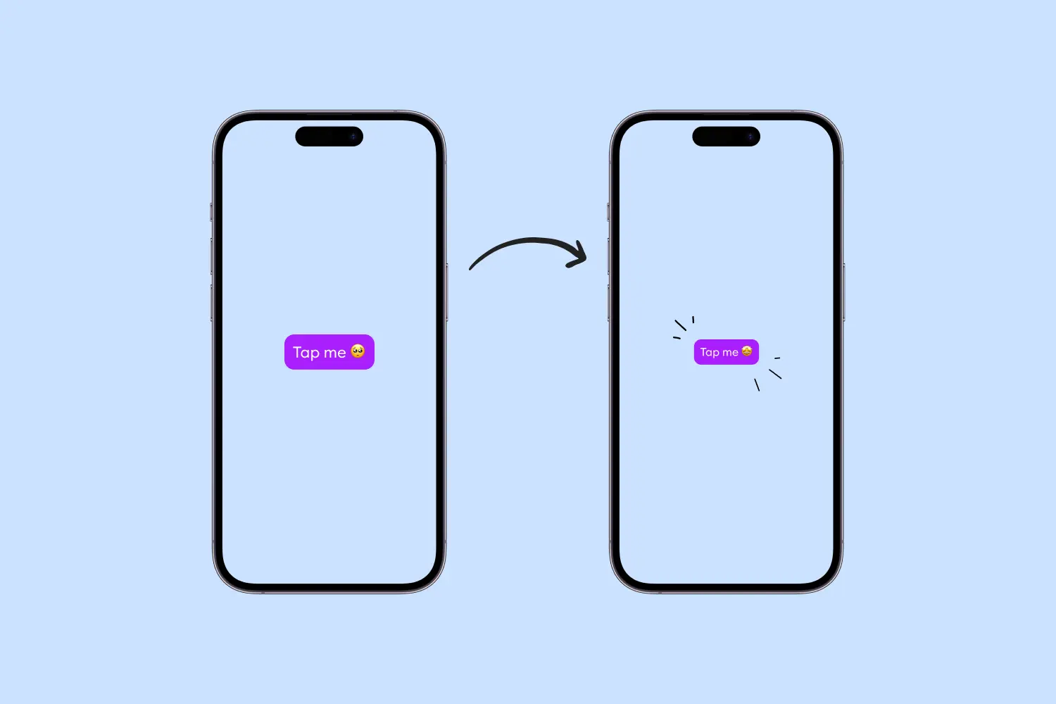
User interface animations are a key aspect of modern app development, as they enhance the user experience by providing visual feedback and making interactions feel more intuitive. In this tutorial, we'll show how to create a button that responds to user interactions with a smooth scaling animation.
What might sound like an easy task, in reality, is not that straightforward. So let's dig in.
Create a Project
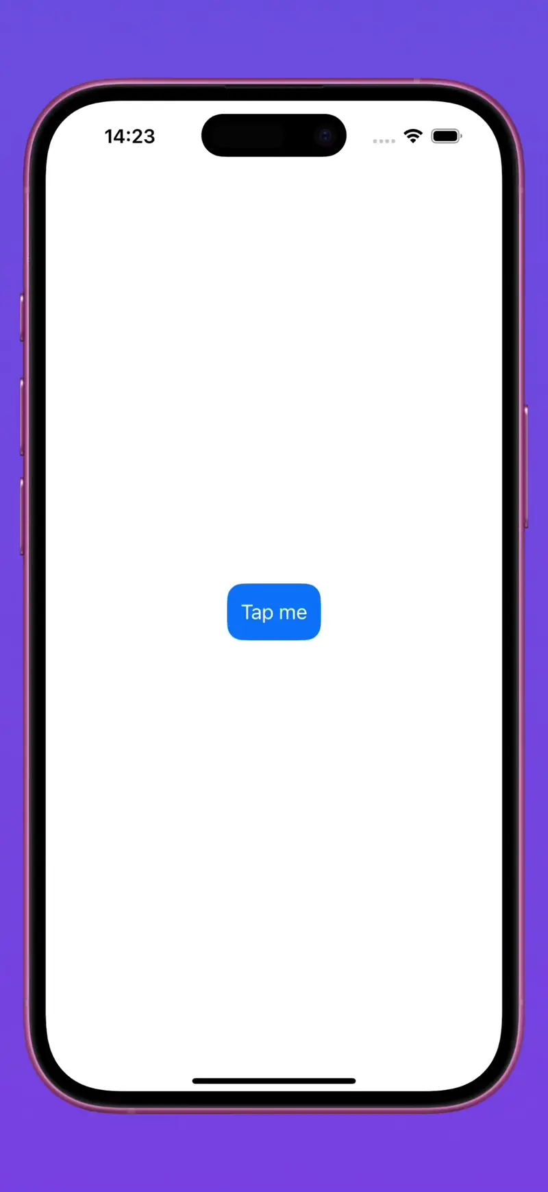
Let's start by creating a simple project: a screen with a button in the center.
struct App: View {
    var body: some View {
        Button("Tap me") {
            // Handle button's tap
        }
        .padding()
        .foregroundStyle(Color.white)
        .background(Color.blue)
        .clipShape(RoundedRectangle(cornerRadius: 16))
    }
}
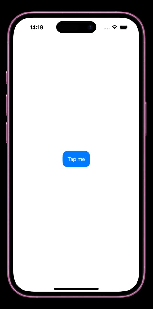
Here, we create a button that has a white title and a blue background. We apply padding for spacing around the text and use .foregroundStyle(Color.white) to set the text color to white. The .background(Color.blue) modifier gives the button a blue background, and .clipShape(RoundedRectangle(cornerRadius: 16)) rounds the corners of the button for a nicer appearance.
Add Animations
There are a few ways to add a scaling animation to the button. Let's try all of them and see their advantages and disadvantages.
Creating a Custom Button Style
The first way to create an animating button is by creating a custom button style.
The ButtonStyle protocol is used to customize a button’s appearance. To configure the button style for a view, we create a struct conforming to the ButtonStyle protocol and then use the buttonStyle(_:) modifier to apply the newly created style.
The ButtonStyle protocol requires the makeBody(configuration: Configuration) function to be implemented, where we get the opportunity to customize our button.
First, let's rewrite our project using a custom button style.
struct AnimatedButtonStyle: ButtonStyle {
    func makeBody(configuration: Configuration) -> some View {
        return configuration.label
            .padding()
            .foregroundStyle(Color.white)
            .background(Color.blue)
            .clipShape(RoundedRectangle(cornerRadius: 16))
    }
}

struct App: View {
    var body: some View {
        Button("Tap me") {
            // Handle button's tap
        }
        .buttonStyle(AnimatedButtonStyle())
    }
}
In this code, we define an AnimatedButtonStyle that encapsulates the button's styling. The configuration.label represents the button's content, and we apply the same modifiers as before to style it. We then apply this style to our button using .buttonStyle(AnimatedButtonStyle()).
To add the animation, we need to modify the AnimatedButtonStyle to scale the button when it's pressed. We can use the configuration.isPressed property to check if the button is currently pressed. If it is, we scale it down to 95% of its original size using .scaleEffect(configuration.isPressed ? 0.95 : 1). We also add an animation modifier to animate the scaling smoothly over 0.1 seconds.
Here's the updated code:
struct AnimatedButtonStyle: ButtonStyle {
    func makeBody(configuration: Configuration) -> some View {
        return configuration.label
            .padding()
            .foregroundStyle(Color.white)
            .background(Color.blue)
            .clipShape(RoundedRectangle(cornerRadius: 16))
            .scaleEffect(configuration.isPressed ? 0.95 : 1)
            .animation(.linear(duration: 0.1), value: configuration.isPressed)
    }
}
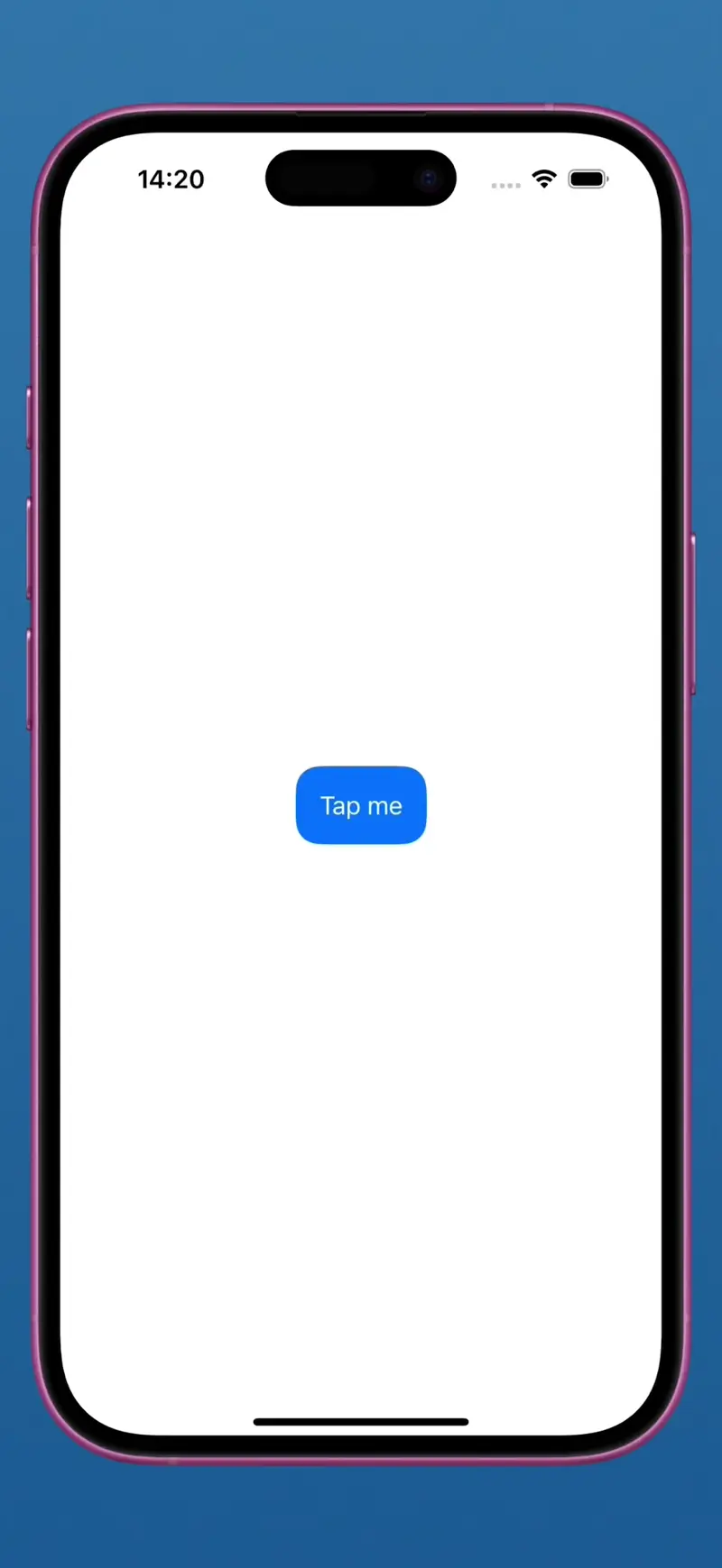
It works nicely, but not perfectly. If the button is tapped too frequently, sometimes it doesn't go back to the initial state. This can be improved by decreasing the animation duration but can't be fully fixed since the isPressed property updates with a small delay.
Leveraging a Gesture Recognizer
A better approach would be adding a drag gesture recognizer to the button. It helps us identify when the button is touched by the user and instantly update the interface. The implementation looks like this:
struct App: View {
    @State private var isPressed: Bool = false

    var body: some View {
        Button("Tap me") {
            // Handle button's tap
        }
        .padding()
        .foregroundStyle(Color.white)
        .background(Color.blue)
        .clipShape(RoundedRectangle(cornerRadius: 16))
        .simultaneousGesture(
            DragGesture(minimumDistance: 0.0)
                .onChanged { _ in
                    self.isPressed = true
                }
                .onEnded { _ in
                    self.isPressed = false
                }
        )
        .scaleEffect(self.isPressed ? 0.95 : 1, anchor: .center)
    }
}
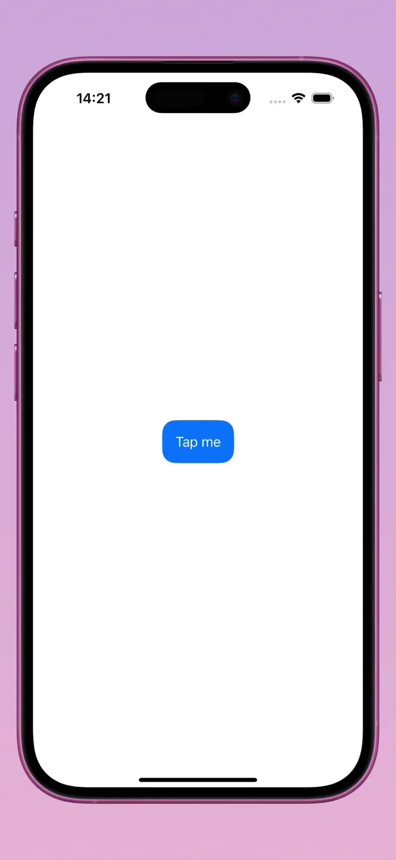
Here we introduce a state variable isPressed to keep track of the button's pressed state. We then add a simultaneous gesture to the button—a DragGesture with minimumDistance set to zero, so it begins immediately when the button is touched.
In the gesture's onChanged closure, we set isPressed to true, and in the onEnded closure, we set it back to false. We apply a scale effect based on the isPressed state, scaling down the button when it's pressed.
This approach works much better than the first one since the changes in the user interface are reflected instantly. Even when we touch the button frequently, it works as expected.
Using SUButton from ComponentsKit
The Button component from ComponentsKit has a scaling animation by default, so you can achieve the same behavior as described before but by writing much less code. Apart from having built-in animations, it's super easy to configure the appearance to suit your needs: you can change corner radius, colors, fonts, and more—all with a simple and intuitive API.
Example:
import ComponentsKit

struct App: View {
    var body: some View {
        SUButton(
            model: .init {
                $0.title = "Tap me"
                $0.color = .accent
                $0.cornerRadius = .large
            },
            action: {
                // Handle button's tap
            }
        )
    }
}
Wrapping It Up
There are two main approaches to add a scaling animation to a button in SwiftUI: using a custom ButtonStyle and leveraging a DragGesture recognizer. While the first one is more intuitive, it has disadvantages such as a visible latency between touching a button and performing the animation. The second approach offers a smoother animation and is more preferable for immediate visual feedback.
Another approach to have a button with a scaling animation is to use the SUButton element from the SwiftComponents library, which is easy to use and integrate into your project. Apart from the button, you'll get access to many other components that will speed up your development.