Alert
An alert with a title, message, and up to two action buttons.
Note:
All actions in an alert dismiss the alert after the action runs. If no actions are present, a standard “OK” action is included.
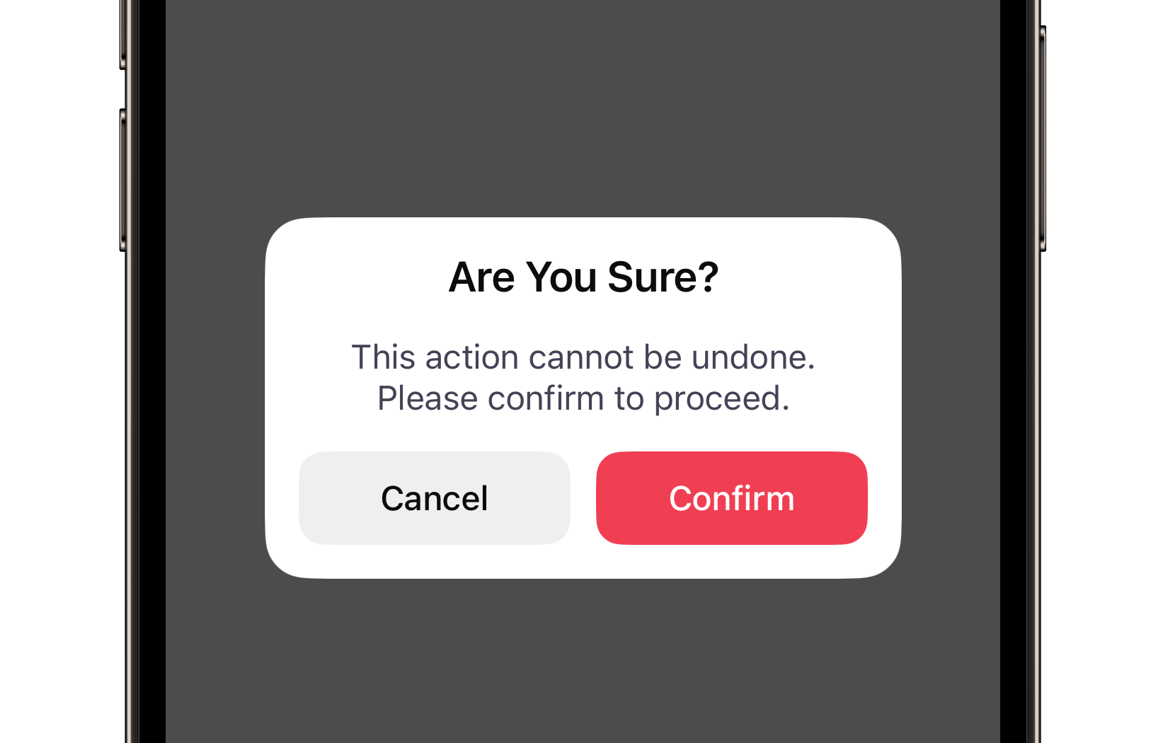
Preview
Code Example
API
AlertVM Props
A model that defines the appearance properties for an alert.
| Name | Type | Default | Description |
|---|---|---|---|
title | String? | nil | The title of the alert. |
message | String? | nil | The message of the alert. |
primaryButton | AlertButtonVM? | nil | The model that defines the appearance properties for a primary button in the alert. If it is nil, the primary button will not be displayed. |
secondaryButton | AlertButtonVM? | nil | The model that defines the appearance properties for a secondary button in the alert. If it is nil, the secondary button will not be displayed. |
backgroundColor | UniversalColor? | nil | The background color of the alert. |
backgroundStyle | BackgroundStyle | solid | The background material style. Supports .solid, .blur, and iOS 26 .liquidGlass. |
borderWidth | BorderWidth | small | The border thickness of the alert. |
closesOnOverlayTap | Bool | false | A Boolean value indicating whether the alert should close when tapping on the overlay. |
contentPaddings | Paddings | 16 | The padding applied to the alert's content area. |
cornerRadius | ContainerRadius | medium | The corner radius of the alert. |
overlayStyle | ModalOverlayStyle | dimmed | The style of the overlay displayed behind the alert. |
transition | ModalTransition | fast | The transition duration of the alert's appearance and dismissal animations. |
AlertButtonVM Props
A model that defines the appearance properties for a button in the alert.
| Name | Type | Default | Description |
|---|---|---|---|
title | String | "" | The text displayed on the button. |
animationScale | AnimationScale | medium | The scaling factor for the button's press animation, with a value between 0 and 1. |
backgroundStyle | BackgroundStyle | solid | The background material style. Supports .solid, .blur, and iOS 26 .liquidGlass. |
color | ComponentColor? | nil | The color of the button. |
cornerRadius | ComponentRadius | medium | The corner radius of the button. |
style | ButtonStyle | filled | The visual style of the button. |
SUAlert
- A SwiftUI view modifier that presents an alert with a Boolean value.
public func suAlert(
  isPresented: Binding<Bool>,
  model: AlertVM,
  primaryAction: (() -> Void)? = nil,
  secondaryAction: (() -> Void)? = nil,
  onDismiss: (() -> Void)? = nil
) -> some View
- A SwiftUI view modifier that presents an alert with an optional
Item.
public func suAlert<Item: Identifiable>(
  item: Binding<Item?>,
  model: @escaping (Item) -> AlertVM,
  primaryAction: ((Item) -> Void)? = nil,
  secondaryAction: ((Item) -> Void)? = nil,
  onDismiss: (() -> Void)? = nil
) -> some View
UKAlertController
Initializers
public init(
  model: AlertVM,
  primaryAction: (() -> Void)? = nil,
  secondaryAction: (() -> Void)? = nil
)
Public Properties
| Name | Type | Description |
|---|---|---|
model | AlertVM | A model that defines the appearance properties for an alert. |
primaryAction | (() -> Void)? | The primary action to be executed when the primary button is tapped. |
secondaryAction | (() -> Void)? | The secondary action to be executed when the secondary button is tapped. |
Public Subviews
| Name | Type | Description |
|---|---|---|
titleLabel | UILabel | The label used to display the title of the alert. |
subtitleLabel | UILabel | The label used to display the subtitle or message of the alert. |
primaryButton | UKButton | The button representing the primary action in the alert. |
secondaryButton | UKButton | The button representing the secondary action in the alert. |
buttonsStackView | UIStackView | A stack view that arranges the primary and secondary buttons. |