Badge
A component that is used to display status, notification counts, or labels.
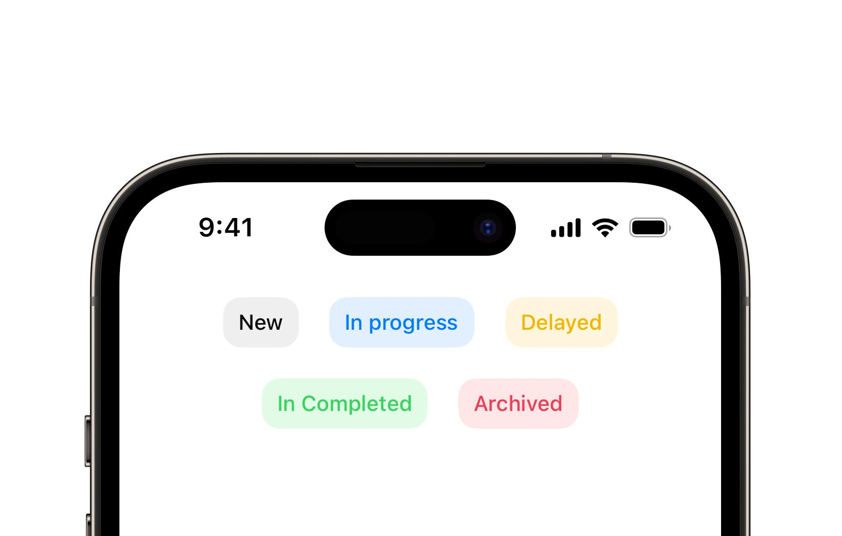
Preview
Code Example
let model = BadgeVM {
  $0.title = "Badge"
  $0.color = .success
  $0.style = .light
  $0.font = .mdButton
  $0.paddings = .init(horizontal: 12, vertical: 10)
}
API
BadgeVM Props
A model that defines the appearance properties for a badge component.
| Name | Type | Default | Description |
|---|
title | String | "" | The text displayed on the badge. |
color | ComponentColor? | nil | The color of the badge. |
cornerRadius | ComponentRadius | medium | The corner radius of the badge. |
font | UniversalFont | .smButton | The font used for the badge's text. |
isEnabled | Bool | true | A Boolean value indicating whether the badge is enabled or disabled. |
paddings | Paddings | Paddings(horizontal: 10, vertical: 8) | Paddings for the badge. |
style | Style | filled | The visual style of the badge. |
SUBadge
public init(model: BadgeVM)
UKBadge
Initializers
public init(model: BadgeVM)
Public Properties
| Name | Type | Description |
|---|
model | ButtonVM | A model that defines the appearance properties. |
Public Subviews
| Name | Type | Description |
|---|
titleLabel | UILabel | A label that displays the title from the model. |