Circular Progress
A component that displays the progress of a task or operation in a circular form.
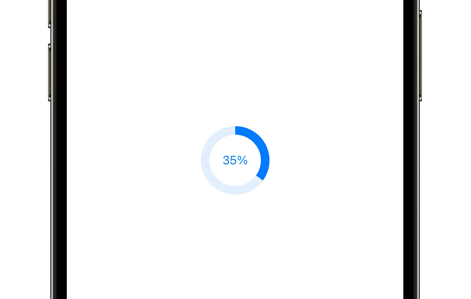
Preview
Code Example
API
CircularProgressVM Props
A model that defines the appearance properties for a circular progress component.
| Name | Type | Default | Description |
|---|---|---|---|
color | ComponentColor | accent | The color of the circular progress. |
currentValue | CGFloat | 0 | The current value of the circular progress. |
font | UniversalFont? | nil | The font used for the circular progress label text. |
label | String? | nil | An optional label to display inside the circular progress. |
lineCap | LineCap | rounded | The style of line endings. |
lineWidth | CGFloat? | nil | The width of the circular progress stroke. |
maxValue | CGFloat | 100 | The maximum value of the circular progress. |
minValue | CGFloat | 0 | The minimum value of the circular progress. |
shape | Shape | circle | The shape of the circular progress indicator. |
size | ComponentSize? | medium | The size of the circular progress. Set to nil to expand to available layout space. |
SUCircularProgress
public init(model: CircularProgressVM)
UKCircularProgress
Initializers
public init(model: CircularProgressVM)
Public Properties
| Name | Type | Description |
|---|---|---|
model | CircularProgressVM | A model that defines the appearance properties. |
currentValue | CGFloat | The current progress value. |
Public Subviews
| Name | Type | Description |
|---|---|---|
backgroundLayer | CAShapeLayer | The shape layer responsible for rendering the background. |
progressLayer | CAShapeLayer | The shape layer responsible for rendering the progress arc. |
label | UILabel | The label used to display text. |