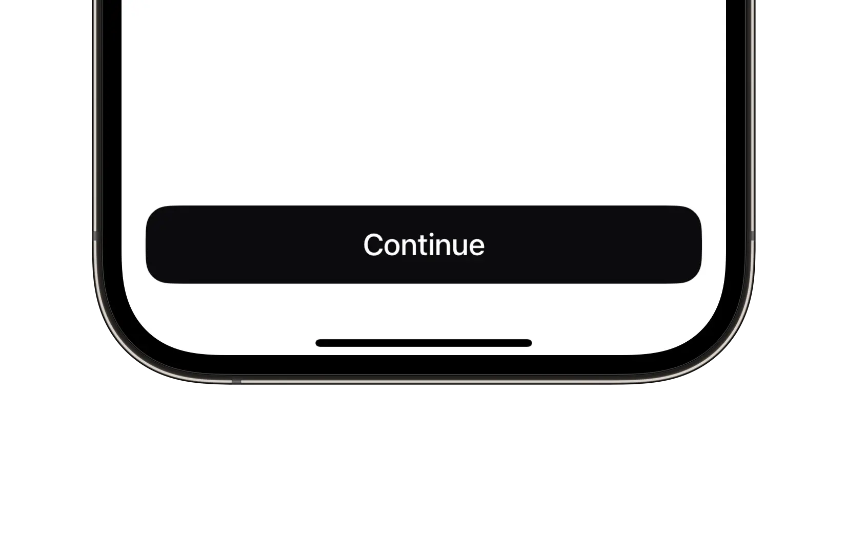
title | String | "" | The text displayed on the button. |
animationScale | AnimationScale | medium | The scaling factor for the button's press animation, with a value between 0 and 1. |
backgroundStyle | BackgroundStyle | solid | The background material style. Supports .solid, .blur, and iOS 26 .liquidGlass. |
color | ComponentColor? | nil | The color of the button. |
contentSpacing | CGFloat | 8.0 | The spacing between the button's title and its image or loading indicator. |
cornerRadius | ComponentRadius | medium | The corner radius of the button. |
font | UniversalFont? | nil | The font used for the button's title text. If not provided, the font is automatically calculated based on the button's size. |
image | UniversalImage? | nil | The image displayed by the button. |
imageLocation | ImageLocation | leading | The position of the image relative to the button's title. |
isEnabled | Bool | true | A Boolean value indicating whether the button is enabled or disabled. |
isFullWidth | Bool | false | A Boolean value indicating whether the button should occupy the full width of its superview. |
isLoading | Bool | false | A Boolean value indicating whether the button is currently in a loading state. |
loadingVM | LoadingVM? | nil | The loading VM used for the loading indicator. If not provided, a default loading view model is used. |
size | ComponentSize | medium | The predefined size of the button. |
style | ButtonStyle | filled | The visual style of the button. |