Slider
A component that lets users select a value from a range by dragging a thumb along a track.
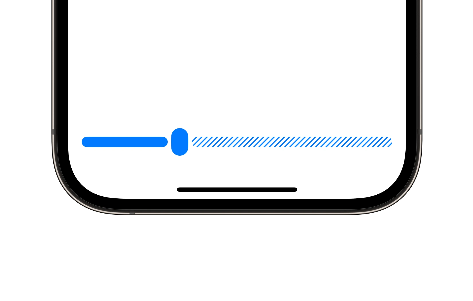
Preview
Code Example
API
SliderVM Props
A model that defines the appearance properties for a slider component.
| Name | Type | Default | Description |
|---|---|---|---|
color | ComponentColor | accent | The color of the slider. |
cornerRadius | ComponentRadius | full | The corner radius of the slider track and handle. |
maxValue | CGFloat | 100 | The maximum value of the slider. |
minValue | CGFloat | 0 | The minimum value of the slider. |
size | ComponentSize | medium | The size of the slider. |
step | CGFloat | 1 | The step value for the slider. |
style | Style | light | The visual style of the slider component. |
SUSlider
public init(
  currentValue: Binding<CGFloat>,
  model: SliderVM = .init()
)
UKSlider
Initializers
public init(
  initialValue: CGFloat = 0,
  model: SliderVM = .init(),
  onValueChange: @escaping (CGFloat) -> Void = { _ in }
)
Public Properties
| Name | Type | Description |
|---|---|---|
onValueChange | (CGFloat) -> Void | A closure that is triggered when the currentValue changes. |
model | SliderVM | A model that defines the appearance properties. |
currentValue | CGFloat | The current value of the slider. |
Public Subviews
| Name | Type | Description |
|---|---|---|
backgroundView | UIView | The background view of the slider track. |
barView | UIView | The filled portion of the slider track. |
stripedLayer | CAShapeLayer | A shape layer used to render striped styling. |
handleView | UIView | The draggable handle representing the current value. |
handleOverlayView | UIView | An overlay view for handle for the large style. |