Progress bar
A component that visually represents the progress of a task or process using a horizontal bar.
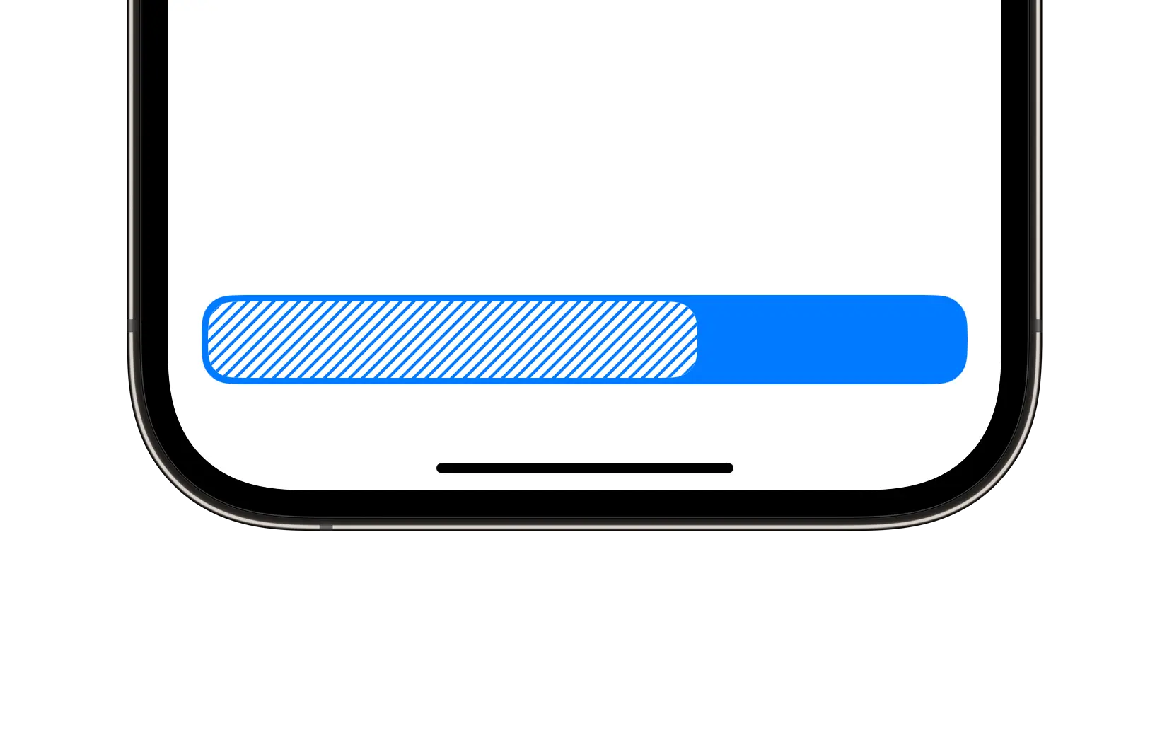
Preview
Code Example
let model = ProgressBarVM {
  $0.currentValue = 65
  $0.cornerRadius = .large
  $0.style = .striped
  $0.color = .primary
}
API
ProgressBarVM Props
A model that defines the appearance properties for a progress bar component.
| Name | Type | Default | Description |
|---|
color | ComponentColor | accent | The color of the progress bar. |
cornerRadius | ComponentRadius | medium | The corner radius of the progress bar. |
currentValue | CGFloat | 0 | The current value of the progress bar. |
maxValue | CGFloat | 100 | The maximum value of the progress bar. |
minValue | CGFloat | 0 | The minimum value of the progress bar. |
size | ComponentSize | medium | The size of the progress bar. |
style | Style | striped | The visual style of the progress bar component. |
SUProgressBar
public init(model: ProgressBarVM)
UKProgressBar
Initializers
public init(model: ProgressBarVM)
Public Properties
| Name | Type | Description |
|---|
model | ProgressBarVM | A model that defines the appearance properties. |
Public Subviews
| Name | Type | Description |
|---|
backgroundView | UIView | The background view of the progress bar. |
progressView | UIView | The view that displays the current progress. |
stripedLayer | CAShapeLayer | A shape layer used to render striped styling. |