Text Input
A component that displays a multi-line text input form.
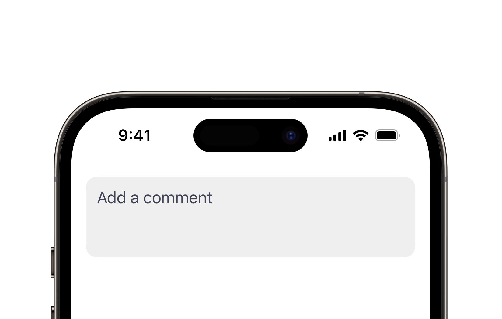
Preview
Code Example
API
TextInputVM Props
A model that defines the appearance properties for a text input component.
| Name | Type | Default | Description |
|---|---|---|---|
autocapitalization | TextAutocapitalization | sentences | The autocapitalization behavior for the text input. |
color | ComponentColor? | nil | The color of the text input. |
cornerRadius | ComponentRadius | medium | The corner radius of the text input. |
font | UniversalFont? | nil | The font used for the text input's text. Determined by size if not set. |
isAutocorrectionEnabled | Bool | true | A Boolean value indicating whether autocorrection is enabled. |
isEnabled | Bool | true | A Boolean value indicating whether the text input is enabled or disabled. |
keyboardType | UIKeyboardType | default | The type of keyboard to display when the text input is active. |
maxRows | Int? | nil | The maximum number of rows the text input can expand to. |
minRows | Int | 2 | The minimum number of rows the text input can occupy. |
placeholder | String? | nil | The placeholder text displayed when there is no input. |
size | ComponentSize | medium | The predefined size of the text input. |
style | InputStyle | light | The visual style of the text input. |
submitType | SubmitType | return | The type of the submit button on the keyboard. |
tintColor | UniversalColor | accent | The tint color applied to the text input's cursor. |
SUTextInput
public init(
  text: Binding<String>,
  globalFocus: FocusState<FocusValue>.Binding,
  localFocus: FocusValue,
  model: TextInputVM = .init()
)
public init(
  text: Binding<String>,
  isFocused: FocusState<Bool>.Binding,
  model: TextInputVM = .init()
)
public init(
  text: Binding<String>,
  model: TextInputVM = .init()
)
UKTextInput
Initializers
public init(
  initialText: String = "",
  model: TextInputVM = .init(),
  onValueChange: @escaping (String) -> Void = { _ in }
)
Public Properties
| Name | Type | Description |
|---|---|---|
onValueChange | (String) -> Void | A closure that is triggered when the text changes. |
model | TextInputVM | A model that defines the appearance properties. |
text | String | A text inputted in the field. |
Public Subviews
| Name | Type | Description |
|---|---|---|
textView | UITextView | An underlying text view instance from the standard library. |
placeholderLabel | UILabel | A label used to display placeholder text when the inputted text is empty. |