Checkbox
A component that can be selected by a user.
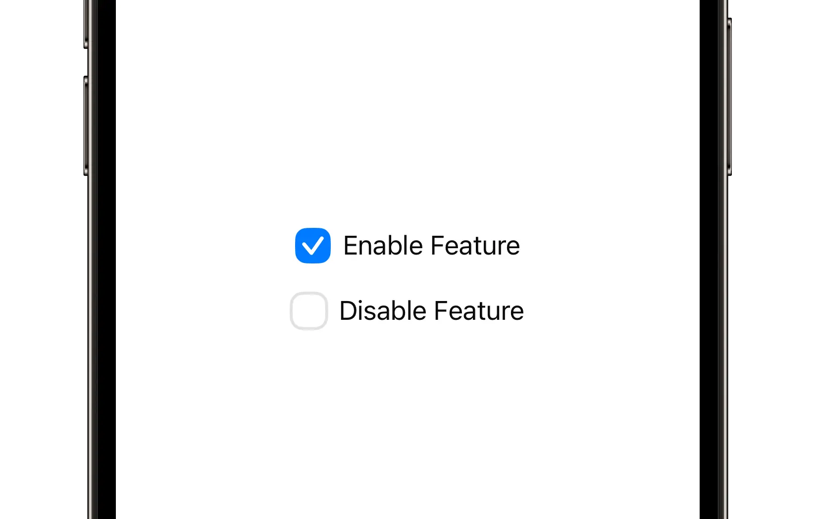
Preview
Code Example
API
CheckboxVM Props
A model that defines the appearance properties for a checkbox component.
| Name | Type | Default | Description |
|---|---|---|---|
title | String? | nil | The label text displayed next to the checkbox. |
color | ComponentColor | accent | The color of the checkbox. |
cornerRadius | ComponentRadius | medium | The corner radius of the checkbox. |
font | UniversalFont? | nil | The font used for the checkbox label text. If not provided, the font is automatically calculated based on the checkbox's size. |
isEnabled | Bool | true | A Boolean value indicating whether the checkbox is enabled or disabled. |
size | ComponentSize | medium | The predefined size of the checkbox. |
SUCheckbox
public init(
  isSelected: Binding<Bool>,
  model: CheckboxVM = .init()
)
UKCheckbox
Initializers
public init(
  initialValue: Bool = false,
  model: CheckboxVM = .init(),
  onValueChange: @escaping (Bool) -> Void = { _ in }
)
Public Properties
| Name | Type | Description |
|---|---|---|
onValueChange | (Bool) -> Void | A closure that is triggered when the checkbox is selected or unselected. |
model | CheckboxVM | A model that defines the appearance properties. |
isSelected | Bool | A Boolean value indicating whether the checkbox is selected. |
Public Subviews
| Name | Type | Description |
|---|---|---|
titleLabel | UILabel | A label that displays the title from the model. |
stackView | UIStackView | A stack view that contains a checkbox and a title label. |
checkboxContainer | UIView | A view that contains another view with a checkmark. Animates the checkbox border. |
checkboxBackground | UIView | A view that contains a checkmark. Animates the checkbox background. |
checkmarkLayer | CAShapeLayer | A layer that draws a checkmark. |