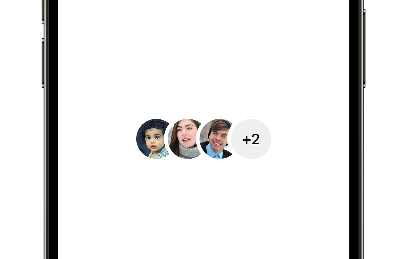
Avatar Group
A component that displays a group of avatars.
Preview
Code Example
API
AvatarGroupVM Props
A model that defines the appearance properties for an avatar group component.
| Name | Type | Default | Description |
|---|---|---|---|
borderColor | UniversalColor | .background | The border color of avatars. |
color | ComponentColor? | nil | The color of the placeholders. |
cornerRadius | ComponentRadius | full | The corner radius of the avatars. |
items | [AvatarItemVM] | [] | The array of avatars in the group. |
maxVisibleAvatars | Int | 5 | The maximum number of visible avatars. |
size | ComponentSize | medium | The predefined size of the component. |
AvatarItemVM Props
A model that defines the appearance properties for an avatar in the group.
| Name | Type | Default | Description |
|---|---|---|---|
imageSrc | AvatarVM.ImageSource? | nil | The source of the image to be displayed. |
placeholder | AvatarVM.Placeholder | .image(UniversalImage("avatar_placeholder")) | The placeholder that is displayed if the image is not provided or fails to load. |
SUAvatarGroup
public init(model: AvatarGroupVM)
UKAvatarGroup
Initializers
public init(model: AvatarGroupVM)
Public Properties
| Name | Type | Description |
|---|---|---|
model | AvatarGroupVM | A model that defines the appearance properties. |
Public Subviews
| Name | Type | Description |
|---|---|---|
stackView | UIStackView | The stack view that contains avatars. |